Business intelligence tools are built to explain what happened last quarter, and they are good at it. That is a different job from telling an owner what needs attention before lunch. The distinction matters because it changes the entire design: refresh frequency, which figures earn space, and whether a number is a total or an exception. A monthly revenue chart is useful, but it is not an operations dashboard. The operational question is narrower and more urgent: what is stuck, what is late, who owns it, and what will break if nobody acts. A dashboard that cannot answer that becomes a prettier report, and reports do not run the morning.
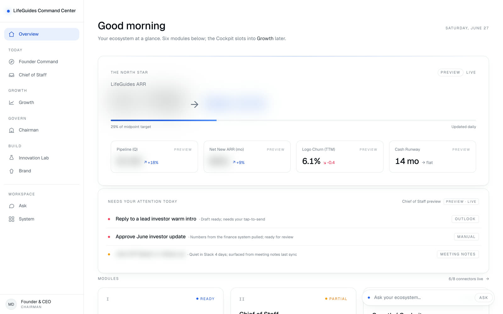
The mechanism we build is an operating truth layer. Every tile on the screen points back to a system of record, a freshness rule, and a decision. That means the dashboard is not allowed to become a pile of attractive numbers. It has to know where the number came from, when it was last trusted, what threshold makes it matter, and what record sits underneath it. In the LifeGuides Command Center, the founder does not open six tools to remember the state of the company. Founder Command holds the North Star, KPIs, goals, and the week's priorities. Chief of Staff surfaces replies, approvals, and items that need a decision. Growth reads the pipeline from the CRM in aggregate. Chairman tracks board prep, investor updates, the option pool, and hiring plan. The point is not more charts. The point is one version of the business that is current enough to run.
A dashboard fed by a nightly export is a report with better styling, and people work out its true freshness quickly. After that, they go back to asking someone. Reading from the systems that hold the records, as those records change, is what makes the screen trustworthy enough to replace the asking. That does not mean every number deserves the same refresh cycle. Same-day decisions need live or near-live inputs. Strategic rollups can tolerate slower computation if the screen says so plainly. What matters is honesty. If a founder sees pipeline, mail, meeting notes, outbound health, and investor actions in one place, the screen has to distinguish live data from pending connectors and preview content. Otherwise it trains the team to distrust the whole surface.
Dashboards accumulate tiles because adding one is easy and removing one feels like a loss. The result is a screen dense with figures nobody has changed a decision over in months, which trains people to stop reading it. The discipline is to start from the decisions the operation actually makes each day and work backwards to the smallest set of numbers that informs them. In LifeGuides, that meant organizing the company into rooms a founder actually thinks in: Founder, Chief of Staff, Growth, Innovation, Chairman, and Brand & Second Brain. Each room has a job. Each room earns the screen by changing what the founder does next. Everything else belongs in a report someone opens deliberately, not on the operating surface meant to be glanced at.
The worst version of a dashboard is a television people are expected to watch. That creates another job instead of removing one. A useful operations dashboard highlights exceptions, routes ownership, and lets the team drill into the underlying record. In the LifeGuides Cockpit, the growth engine does not simply show a send count. It shows worker health, success rates, p95 duration, error counts, four ICP arms, A/B tests, and cost by service. The founder can see whether the system ran, whether it is getting replies, whether an audience is worth more spend, and whether the machine should pause. That is the difference between analytics and command.
Good dashboard work is not only engineering. It is editorial. Someone has to decide what earns the first viewport, what belongs behind a drill-down, what should become an alert, and what should disappear entirely. The LifeGuides Command Center is deliberately calm because the founder's problem was not a shortage of information. The problem was status living across a dozen tabs, with the important buried inside the urgent. The screen opens with the North Star and the week, then gives each domain a room. That shape matters. If the dashboard looks like a data warehouse exploded onto a page, nobody uses it when the day gets loud.